OS X

WWDC 2016 by Adrian Galli

Apple's twenty-seventh year of the famous World Wide Developers Concerence and this years was no disappointment.

Not only have I worked for Apple for thirteen years, the technology that Apple innovates drives my business and personal life in ways I could not begin to communicate in a blog post. WWDC is always an exciting time of year for us in the technology industry and with Apple's four pillars of software development, iOS, macOS (formerly OS X [ten]), watchOS, and tvOS, there is more engagement than ever.

iOS 10 Today View

iOS 10 Today View

iOS 10 is the biggest advancement in the most advanced mobile operating system since the dawn of iOS. With rich notifications and widgets right from the lock screen, raise to wake, and more interactions using 3D Touch, iPhones and iPads are becoming even more powerful and this opens huge doors to developers.

The biggest announcement, I think, is the availability of Siri api. Third party applications can be designed to integrate with Siri like those built by Apple. Image: "Hey Siri, I need a Lyft to Midway Airport." Or: "Hey Siri, I'd like a flight on Delta to London, departing August 17th, in business class." With Apple Pay, one can then pay in moments after Siri find the appropriate response to the query. I can't wait to see what developers do with Siri.

macOS has been the core of the Mac for 15 years. It is an incredibly powerful, intuitive, and secure operating system that runs every Mac. Sierra, the name for macOS 10.12, has great power behind it. Siri, again, is no doubt my favorite feature with integration with the desktop operating system.

Siri, at its core function, powers a voice interface for all of Apple's major products now and can be access from all of these devices: Apple Watch, Mac, iPhone, iPad, AppleTV. If you don't use Siri, you're missing out on the power, ease of use, and fun.

With a longer list of great features like Picture in Picture, an upgraded Photos app, Apple Pay for web, Universal Clipboard (also part of iOS), Tabs for all [multi-window] applications, and advances in the integration with iCloud Drive, macOS will power the next generations of Macs.

Apple Watch was released a little over a year ago. It rarely leaves my wrist and has quickly become one of my favorite tools. Not to be relegated to "gadget status," I find I'm free from my iPhone. I used to drag my iPhone from room to room in anticipation of a message or a call or needing to know some piece of data like weather. But with Apple Watch, my iPhone rests nicely on the coffee table or night stand for hours while I'm at home and Apple Watch fills in while I'm free to move about and not taking my most valuable computer with me. 

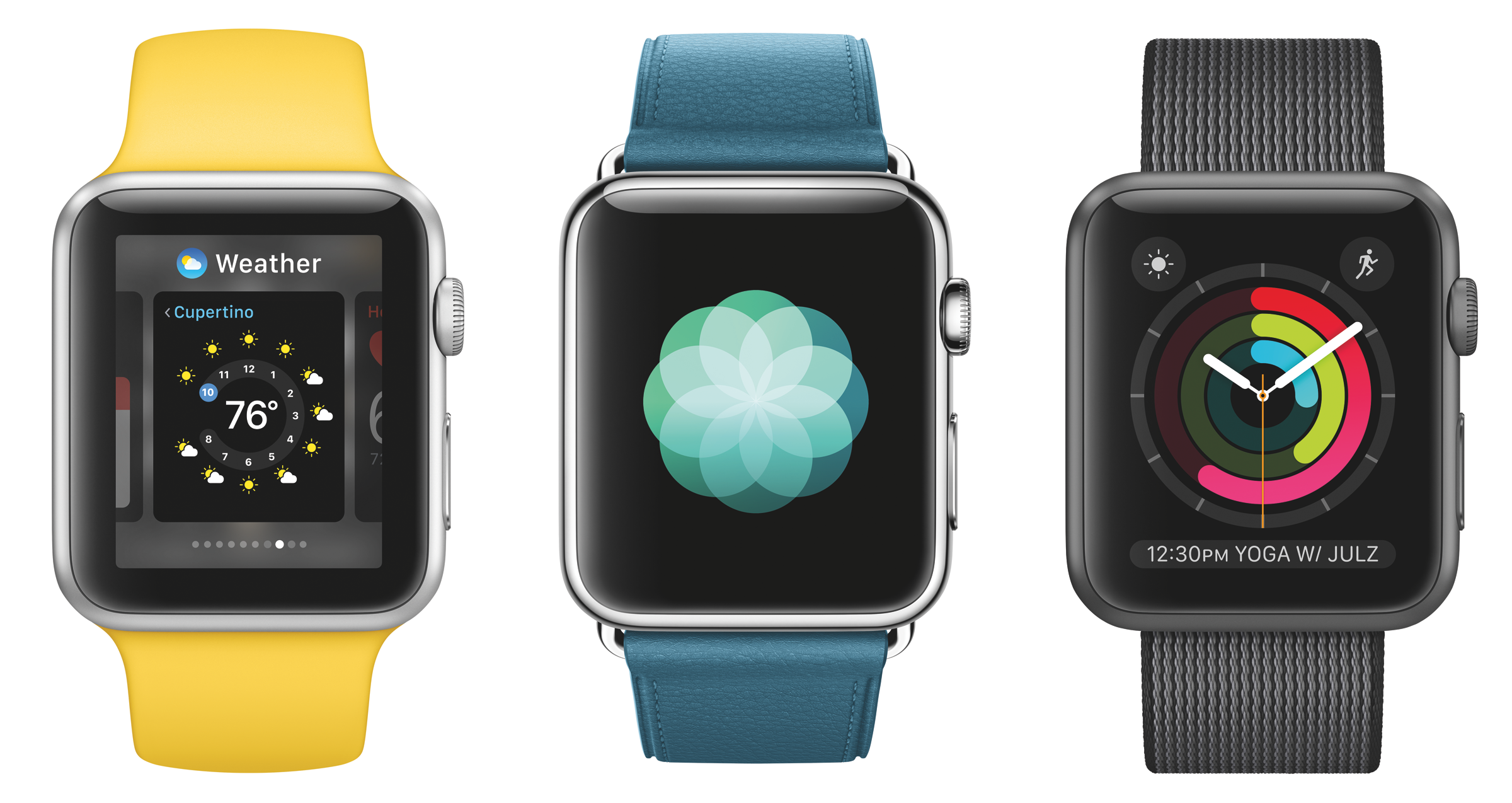
watchOS 3 Dock, Breathe, Activity Watch Face

watchOS 3 Dock, Breathe, Activity Watch Face

watchOS 3 builds on a powerful and ever tiny computer for your wrist. The speed, up seven fold, the interface tweaked to allow quicker access to you most used apps, and new input methods for text that give freedom when Dictation isn't a viable option. Securely unlock your Mac while wearing your Apple Watch or use Apple Pay for the web to buy things quickly and securely online. Apple brings a whole new set of features to watchOS just for people who utilize wheelchairs and stress a relieving app to help lower said stress. The evolution of Apple Watch is just at the beginning. 

Lastly, Apple TV, the device that let me cut a major expense (cable) out of my life. Video on demand, iTunes purchases, Apple Music, Siri, games, and more, make the AppleTV a favorite TV and gaming console. Now supporting four controllers, developers have new opportunities for gaming and users have more opportunities for fun with friends and family. 

Check out all the new features in the online previews and be ready for the free upgrades in the fall. This is sure to be an awesome year for Apple technology.

www.apple.com

Images courtesy of Apple PR

Photos Tips and Tricks: Using Black and White Controls by Adrian Galli

Black and white photography is the original; classic, striking, moody, and reduces the photo to a more fundamental state. It is one of my favorite forms of photography and from some of the most famous photographers, there is nothing quite like it. Ansel Adams, Mary Ellen Mark, Yusuf Karsh, amount many others, are renown for their use of black and white.

In today's digital world, there are very few actual black and white cameras; the Leica Monochrom, Red Epic-M Dragon (monochrome) are a few notable examples that come to mind but, generally, if you're using a digital camera, even with a black and white mode, you're shooting color (RGB — red, green, blue) and it is converted to black and white. In other words, if you're making or seeing black and white digital photography, chances are you're look it was originally color.

Without giving a long scientific explanation of why or how digital cameras work, a "general" digital camera have a sensor with pixels, each capturing its own color: red, green, or blue. The Leica M Monochrom uses a sensor where each pixel captures only luminance.

Many of us simply can't afford a Leica or we would really like the option of color photography. Sadly, we can't, or currently can't, have a camera that is "dual-action" color or mono. As such, we'll need to settle for one or the other but don't be discouraged, a color photo can be altered into a stunning black and white photography.

In OS X's Photos app, there are three filters for use to convert your images: Mono, Tonal, and Noir (my personal favorite). Having covered how to use filters in a previous post, we'll forego these and move into a more advanced technique for black and white conversions and more flexible.

Original image, enhanced, no black and white.

Original image, enhanced, no black and white.

Opening an image and entering the edit mode, one will click on Adjustments. Even with the default option for adjustments, black and white is a already visible. Using the adjustment is a simple using the slider until the desired black and white appearance is achieved. This adjustment mimics the effects of using a color filter on black and white film.

Red Filter (right) vs. Blue Filter (left)

Red Filter (right) vs. Blue Filter (left)

This alone will give you more flexibility than just the general black and white filters. However, opening the adjustments will bring more control and a finer look should the basic black and white slider.

Upon opening Black & White, four additional sliders are available: Intensity, Neutrals, Tone, and Grain.

These adjustments are the key to taking advantage of the black and white capabilities of Photos. While it is a simple toolset, there is a great amount of flexibility, like nothing found in iPhoto, and also found on the iOS version of Photos. It is far different from yours average black and white conversion tool found in other apps, I have come to enjoy the ease and power.

Intensity: The strength by which the effect is applied to the photo.
Neutrals: Lightens or darkens the gray areas (midtones) of the photo.
Tone: Adjusts the photo for a more high-contrast or low-contrast look.
Grain: Adjusts the amount of film grain that appears in the photo.

For the final version of Art Deco Mountain, I initially expected I would use the Noir built-in filter, however, I found it too intense. While I wanted a nearly black sky with high contract with the highlights, the shadow area of the building was too dark.  Applying the Black & White adjustment and fine tuning the Intensity, Neutrals, and Tone, the sky looked as I wished as did the building. 

Art Deco Mountain

Art Deco Mountain

Making good use of these four adjustments on can achieve many high quality black and white effects on a photograph. This is to say, we should not forget about the many other adjustments available in Photos as things like Color, Contrast, Definition, and many others will also impact your black and white photography.

Photos Tips and Tricks: Fade Filter with Adjustments by Adrian Galli

In 2014, Apple announced iPhoto and Aperture would not longer be developed. iPhoto was released in 2002 and weighed in at well over a gigabyte. It was an old, slow, and clunky application. While it served many of us well for many years, technology is about new ventures and evolution, not stagnation and rigidity. Aperture was newer, much more powerful in both editing and organizing than iPhoto but also a bit more of a learning curve. But, alas, these applications gave way to a new, singular, more powerful, more efficient, and intuitive application: Photos.

No doubt this ruffled some feathers. People dislike change but when it comes to technology, change is most definitely the constant. Even for technology wizards like my colleagues and I, we still have to learn these new tools. Personally, I was excited. I love to learn a new application, see what it does, how it was designed, and how it will fit into my life.

This was not without growing pains. I had used Aperture since before the public; I beta tested it and was one of three selected to champion it. I wrote training curriculums, taught classes, and used it both personally and professionally; hand to hand, I would put my knowledge of Aperture up against anyones. It was powerful and had some really impressive editing tools. I loved Aperture, as did many others. The end was near, however, for Aperture, so when Photos was announced, I quickly made my way to beta testing it.

The challenge: use Photos exclusively, from day one, and do everything photographic with it for six months. It was time to explore and venture into the unknown and put it to the test. As those who know and follow me, I love a challenge with my creative tools. In fact, I’d go as far to say that I prefer limitations and challenges; it makes me more creative, try harder, innovate, and push my technology and self to new limits.

It little time to feel comfortable with the application as it works nearly identically to its iOS sibling. Photos on OS X is definitely more powerful within the realm of editing and organization but the general functions are the same. If one knows Photos for iOS, one knows Photos for OS X. One might then ask, “How did you fare, Adrian, having used a set of tools that wasn’t as powerful as Aperture’s?"

It was a challenge as first but, while photos starts out with a simple editing toolset, one can expand the tools for more control. It makes general adjustments simple for users looking for quick and easy editing while more advance editors can take a deeper dive. I found that Photos was getting a bad wrap because there were some really powerful tools, some of which aren’t even in Photoshop, and with a little creativity and ingenuity, there was real opportunity to do some great work.

One of these toolsets is Filter. There are eight total: five color and three black and white. On first approach, these filters seem rather simplistic; they emulate certain film stocks, polaroid, or film processing technique, etc. Initially one might question the validity as they can be rather “bold” in their adjustments to a photo (though, I really like Noir). And when it comes to filters, eight is child play. VSCO has dozens. Instagram, Afterlight, Enlight, and many other also give tons of filters for one’s photo filtering needs. But, there in lies the problem; these apps give people a false assumption of how one could work in Photos. Generally, filters in apps are tap and go and maybe with a little extra fine-tuning; find your photo, add a filter, share it. Done. In Photos, one needs to be a little more creative and leave behind the simplistic nature of a lot of that general mobile photo editing app experience. (Note: there are plenty of iOS editing apps that are very powerful. I write this in general terms.)

Photos Tips and Tricks is a series launched from this very observation. The tools available to us in Photos are not just to be used in exclusivity but in tandem with others. And that Photos is, in fact, much more powerful than iPhoto, and a lot can be accomplished if one actually takes advantage of the tools. So let us start with the inaugural tip: Fade Filter with Adjustments.

This filter became a favorite of mine but I didn’t care much for it when I first applied it and generally find it too plain when applied alone. I needed to take my editing into the Adjustments section of Photos to make it work.

Down and to the Right (original), Olympus E-M5, Panasonic 14mm f2.5 at f5.6

Down and to the Right (original), Olympus E-M5, Panasonic 14mm f2.5 at f5.6

Fade Filter with Color Adjustment

Above is the original image for Down and to the Right. It was shot using the Olympus E-M5 with a Panasonic 14mm f2.5 lens at f5.6. The image itself is rather flat and needs some processing to make it pop so let’s start with the Fade Filter.

Step 1
Entering the edit mode by clicking on Edit in the upper right corner of Photos' window, a list of tools will appear on the right. The fourth toolset it filters.

Step 2
Clicking on the Fade filter, the image loses a fair amount of its color. It does not appear to be a simply reduction of saturation; the color values seem to roll off with the characteristics of being on a curve. Some colors, like green, also fade more with a shift toward yellow.

Image with Fade applied.

Image with Fade applied.

Step 3
With the Fade applied, switch to the Adjustments toolset. This is the very next button below Filters. Initially, you’ll only see a few adjustments: Light, Color, and Black and White. You may notice this looks much like the tools in Photos for iOS. Try dragging the color adjustment to the right. You can make significant inroad with the slider and the photo will hold up.

Image with Color Adjustment applied.

Image with Color Adjustment applied.

Final
The above photo is processed with Fade plus a 60-70% increase to the Color Adjustment. The enhanced photo has a whole new appeal to it; a little filmic, a little more stylized. 

Not all photos should one apply this series of steps. Photos with a lot of blues, indigos, violets, don’t hold up well to this method; those colors tend to over saturate with the Color Adjustment, however, it is possible to fine-tune that as well with the Color Contrast adjustment. That is the beauty of such a creative workflow; it opens one to exploring other options and integrating one tool into another. And this doesn't have to be the end of the editing process. Levels, quarter tones, definition, exposure, etc. are all other tools available for continued processing of a photo.

Feel free to explore the editing possibilities. This is only the start of what can be accomplished in Photos. The best news is, one, Photos never adjusts the original image so playing with a photo, it can always be reverted back to the master. Two, while Photos does have more power than many will give it credit, as with all tools, it does have limits. If more manipulations are needed, Photos in El Capitan (OS 10.11) supports extensions and thus, other editing applications can build into Photos expanding its capabilities. The Mac App store has a section for Photography where extensible apps can be found.

I hope this simple but powerful tip help you edit your images. I hope that I have dispelled a few myths that Photos isn't powerful. It greatly eclipses iPhoto's editing tools and allows for much more flexibility.

I would love to hear your feedback on this tip and if you have any you'd like to share, reader would also welcome your insight. Visit again soon other Photos Tips and Tricks posts.