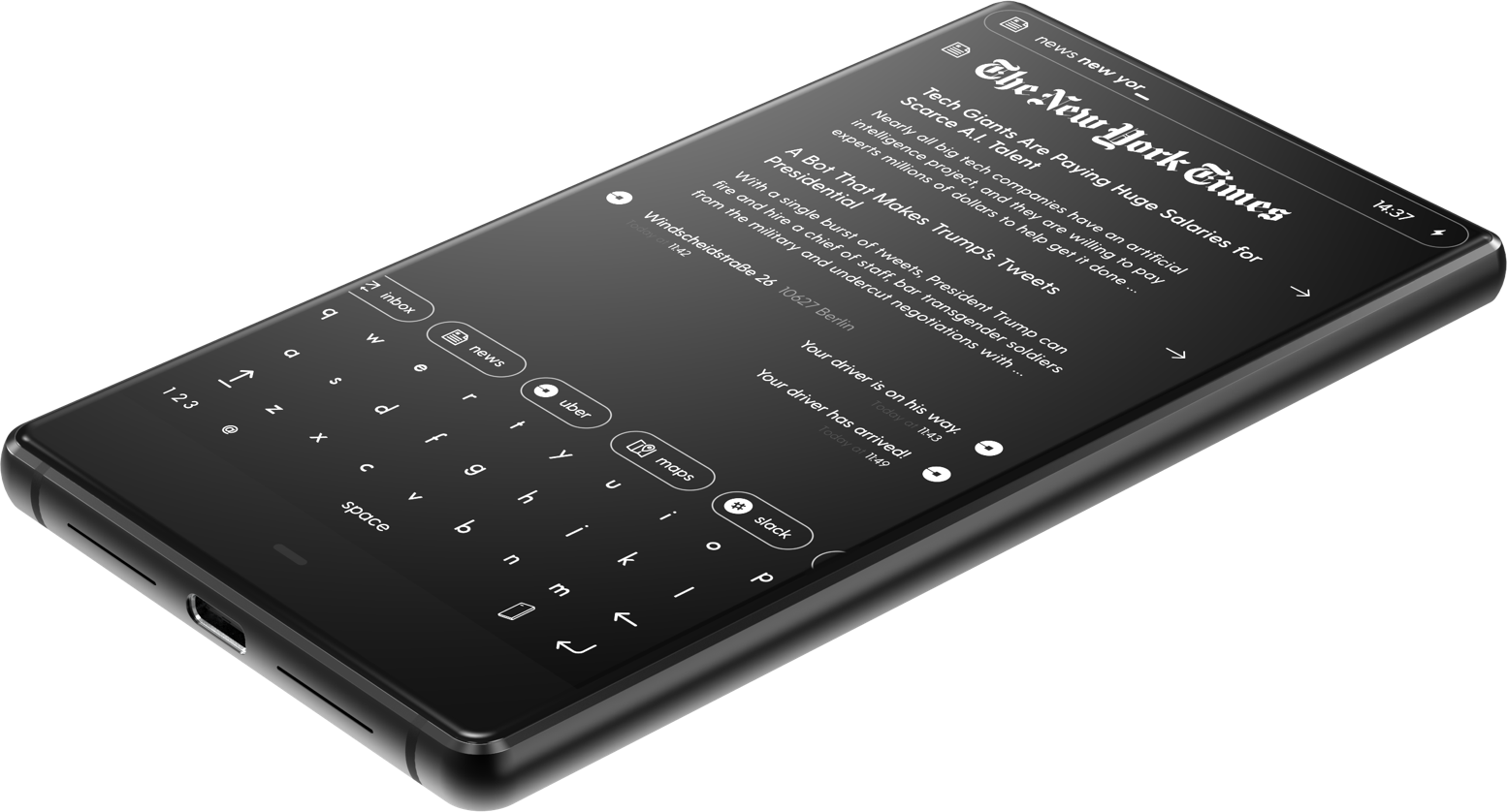
Stunning in Black and White
If black and white photography was a smartphone, it would look like Blloc.
Only a few weeks ago I wrote a short article on how impressed and inspired I was by the Light Phone 2. It’s not a smart phone, not a feature phone, but a phone to help you connect with your friends and family by just being present—no FaceBook, no Instagram, no one thousand and one notifications.
I recently stumbled on another similar device but it captures my imagination and, ultimately, my deep passion for minimalism even more so. Like much of my photography, I prefer simplicity to complexity, black and white to color, and this particular device is not only stunning looking but I also really love the direction that they are taking and the philosophy behind their user interface.
This new device, not yet available, is called BllocZero18. Blloc's design, attention to detail, and minimalism really caught my attention. The screen is monochrome—white objects and text against a black background on a black device. It’s pretty stunning in photos. It focuses on communication, messages, rideshare, news, weather, and other apps but organized in a very different way.
The operating system is based on Android 8.1 but this isn't what one likely expects from an Android device. Rather than the traditional home screen with an ocean of icons, Blloc is engineered around a home screen based on information. They call it the Root but this is not what you expect from android device. It does not have the traditional home screen with an ocean of icons but a home screen based on information. They call it the Root.
“The lost, forgotten and scattered information is now gathered in one place, a simple timeline which facilitates speedy and effective conversations, while Blloc anticipates your needs through learning.”
From Root, you have access to your every day functions like news and weather in a messaging app like interface. I'm very curious to see this I action. I can imagine some of the function and how it will behave but I also expect that have some very slick features not seen.
It somewhat reminded me of iMessage for Business and Blackberry Hub, but with a touch of Pebble OS interface from the extinct smartwatch.
While the majority of one's time is viewing the devices interface in black and white, clearly one would want to see some things, images for example, in color. The OS is smart and will display things that 'should' be color, in color.
I really want to put my money in on Blloc just so I can play with it. It is a beautiful design, inspiring and innovative user interface, and really speaks to my minimalistic nature. Perhaps they will be gracious enough to lend me a review version. I would love to give this device a test.
I encourage you to visit their site and take a look for yourself. It is really something—down right sexy if you ask me.
Price: €359 (≈$425)
Photos courtesy of Blloc

